Case History: Turning Potluck into a Square Meal
 New logo
Updating a Successful Recipe
Fundcraft Publishing, the oldest and largest fundraising cookbook publisher in the country, has been in business for 100 years. Being good at what they do, they have diversified into a wide range of short run printing products and divisions over the past century. Their continued success has provided them with a lot to offer, but it has also left them with a long list of seemingly unrelated companies possessing a tangle of disparate names and graphic styles, logos designed over a fifty-year span, and a confusing maze of websites that often overlap, conflict and sometimes compete with each other. To use a “cookbook” metaphor, the Fundcraft family of products was refusing to sit down at the dinner table together.
Fundcraft Publishing, the oldest and largest fundraising cookbook publisher in the country, has been in business for 100 years. Being good at what they do, they have diversified into a wide range of short run printing products and divisions over the past century. Their continued success has provided them with a lot to offer, but it has also left them with a long list of seemingly unrelated companies possessing a tangle of disparate names and graphic styles, logos designed over a fifty-year span, and a confusing maze of websites that often overlap, conflict and sometimes compete with each other. To use a “cookbook” metaphor, the Fundcraft family of products was refusing to sit down at the dinner table together.
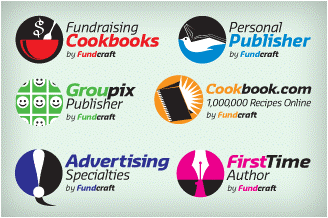 Creating commonality between a diverse product line
Adjusting the Ingredients
I first proposed a new, more descriptive logo for the overall Fundcraft family brand that better communicated “publishing” and utilized color to allow for a “family” of individual logos for each division. These division logos defined and illustrated each publishing entity while remaining compatible with the Fundcraft Publishing logo and each other.
I first proposed a new, more descriptive logo for the overall Fundcraft family brand that better communicated “publishing” and utilized color to allow for a “family” of individual logos for each division. These division logos defined and illustrated each publishing entity while remaining compatible with the Fundcraft Publishing logo and each other.
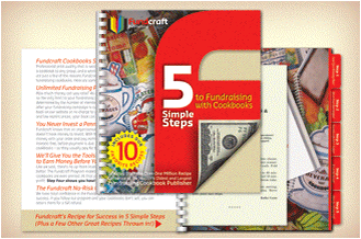 The essence of Fundcraft is fundraising
Seasoning with More "Essence"
The next step was to create a graphic “F” element based on the logotype – providing a visual tool that could be used across the entire Fundcraft line to
illustrate the “fundraising” aspect that is at the heart of the company. This is not just a cookbook and photo book publisher – it is a leader in fundraising.
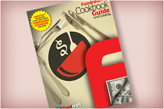 Guide to cookbook fundraising
Setting the Table
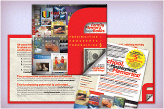
Promos were designed to promote individual products while remaining true to the “Fundcraft” style, bringing focus back to the fact that these were fundraising tools being marketed.
Promos were designed to promote individual products while remaining true to the “Fundcraft” style, bringing focus back to the fact that these were fundraising tools being marketed.
 Cross selling
Maximizing the Menu
While previous Fundcraft promotions had been product-based rather than end-user based, the backs of the new promotions were used to inform about alternative fundraising options the company offered (Cookbooks promoted Photobooks, Photobooks promoted Cookbooks, etc.). This took advantage of the likelihood that fundraising customers would be interested in raising funds in any way possible – including using multiple methods and products.
While previous Fundcraft promotions had been product-based rather than end-user based, the backs of the new promotions were used to inform about alternative fundraising options the company offered (Cookbooks promoted Photobooks, Photobooks promoted Cookbooks, etc.). This took advantage of the likelihood that fundraising customers would be interested in raising funds in any way possible – including using multiple methods and products.
 A family look for websites
Creating a Better Experience
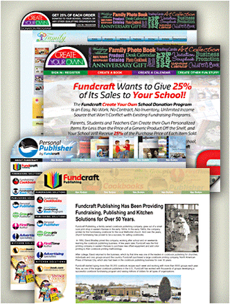
I proposed an easier to navigate website interface that would permit all the company’s websites to share a common visual style while retaining their own identities. The navigation system was more end-user driven – divided into customer categories (fundraising, business and cooking information) rather than product categories. At the top level, all Fundcraft websites were clearly linked to each other in a consistent, logical way.
I proposed an easier to navigate website interface that would permit all the company’s websites to share a common visual style while retaining their own identities. The navigation system was more end-user driven – divided into customer categories (fundraising, business and cooking information) rather than product categories. At the top level, all Fundcraft websites were clearly linked to each other in a consistent, logical way.
